FLOWE
16,000 Users in 7 Days, Italy's First Benefit Corporation Fintech
4.7/5 App Store Rating | 8-Minute Account Opening | 10-Month Concept to Launch
RESULTS
- Adoption: 16,000 active users within 7 days of launch
- App Store rating: 4.7/5 (industry average for financial apps is 3.5)
- Account opening: 8 minutes (industry average: 20+ minutes)
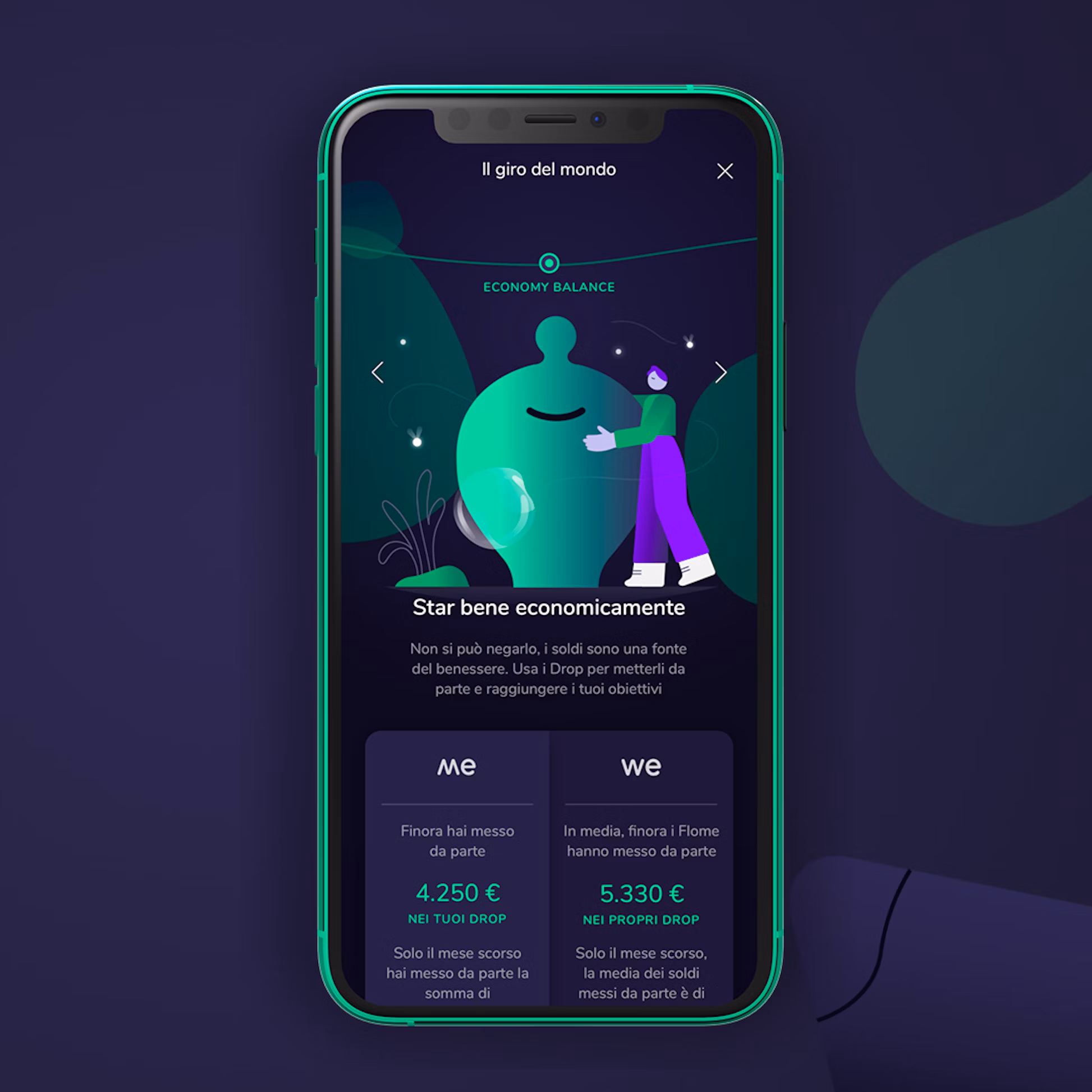
- User savings: Average user saved €5,330 through goal-tracking features
- Design system: 200+ components enabling 53 weekly iterations
- Category creation: First Italian Benefit Corporation in fintech
The platform became the blueprint for sustainable fintech across Europe. More importantly, young users who had never engaged with banking started saving money and tracking their environmental impact.
THE STORY
Banca Mediolanum had a problem. Millennials and Gen Z were not becoming customers. Traditional banks offered products designed for their parents: complex fee structures, jargon-heavy interfaces, and no connection between money and the values young people cared about.
The brief was to create a digital banking product for younger customers. The opportunity was bigger: build Italy's first Benefit Corporation fintech, a new legal structure that required proving social and environmental impact alongside profit.
The brief was to create a digital banking product for younger customers. The opportunity was bigger: build Italy's first Benefit Corporation fintech, a new legal structure that required proving social and environmental impact alongside profit.
WHAT MADE THIS DIFFERENT
Most fintech redesigns optimize existing banking experiences. Flowe required building a new legal structure, a new business model, and a new product simultaneously.
The Benefit Corporation designation meant every design decision had to balance three things: user experience, regulatory compliance, and measurable social impact. If the app didn't change user behavior around sustainability, the legal structure would be questioned.
Our research found the insight: Gen Z didn't want banking products. They wanted a tool that helped them achieve goals and live according to their values. Money was just the mechanism.
MY ROLE
Executive Strategy Director, Sketchin (Bip Group)
I led the C-level relationship and overviewed the transformation across the full 10-month engagement: user research, experience architecture, design system development, and stakeholder coordination across 200+ partners including regulators, technology providers, and sustainability certifiers.
I led the C-level relationship and overviewed the transformation across the full 10-month engagement: user research, experience architecture, design system development, and stakeholder coordination across 200+ partners including regulators, technology providers, and sustainability certifiers.
WHAT I ACTUALLY DID
The Research
We interviewed 120 potential users between 18 and 35. The pattern was consistent: they understood money as a tool for achieving goals, not as an end in itself. They wanted to save for a vacation, not "build savings." They wanted to reduce their environmental footprint, not "optimize spending categories."
Traditional banking apps showed transaction history. These users wanted to see progress toward things they actually cared about.
The Compliance Problem
Three months in, we had beautiful mockups and a clear vision. Then the compliance team reviewed them.
Italian banking regulations required specific disclosures, specific flows, specific terminology. Our simplified onboarding violated six different requirements. The gamification features that made financial education engaging looked like "potential manipulation" to regulators. The environmental impact tracking needed third-party certification we hadn't accounted for.
I spent more time in compliance meetings than I expected. Every design decision became a negotiation: how do we meet the legal requirement without destroying the experience? Sometimes we found elegant solutions. Sometimes we compromised. The 8-minute onboarding we launched with was originally designed to take 4 minutes, but compliance requirements doubled it.
The Benefit Corporation structure added another layer. We needed to prove that the app actually changed user behavior around sustainability. Not "we hope it will" but documented, measurable change. That meant building analytics infrastructure we hadn't planned for.
The Build
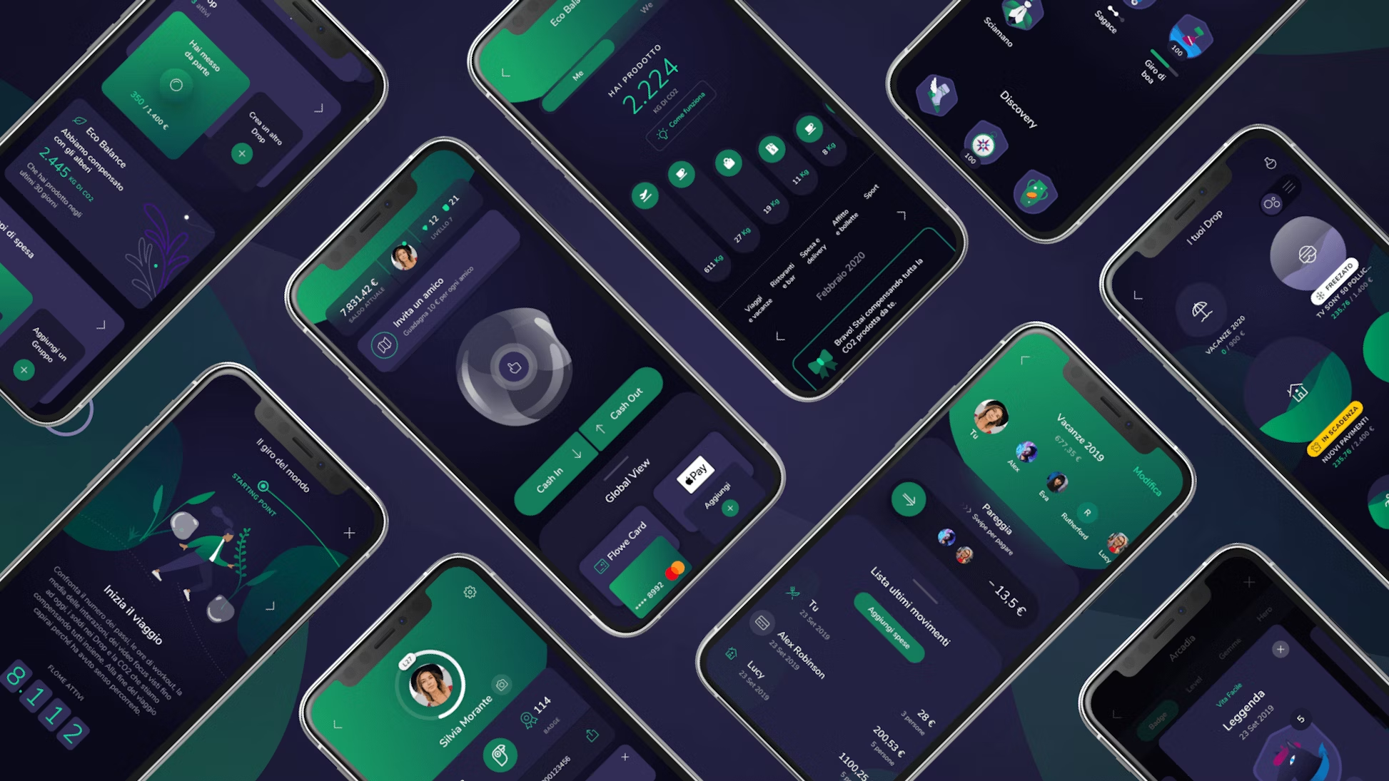
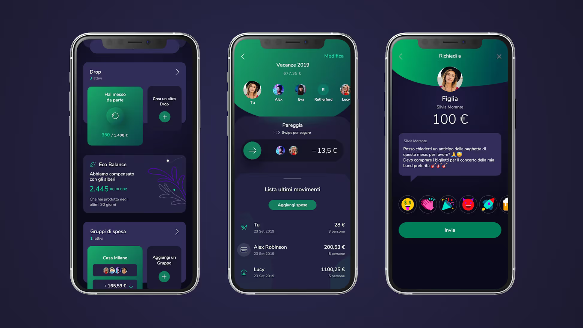
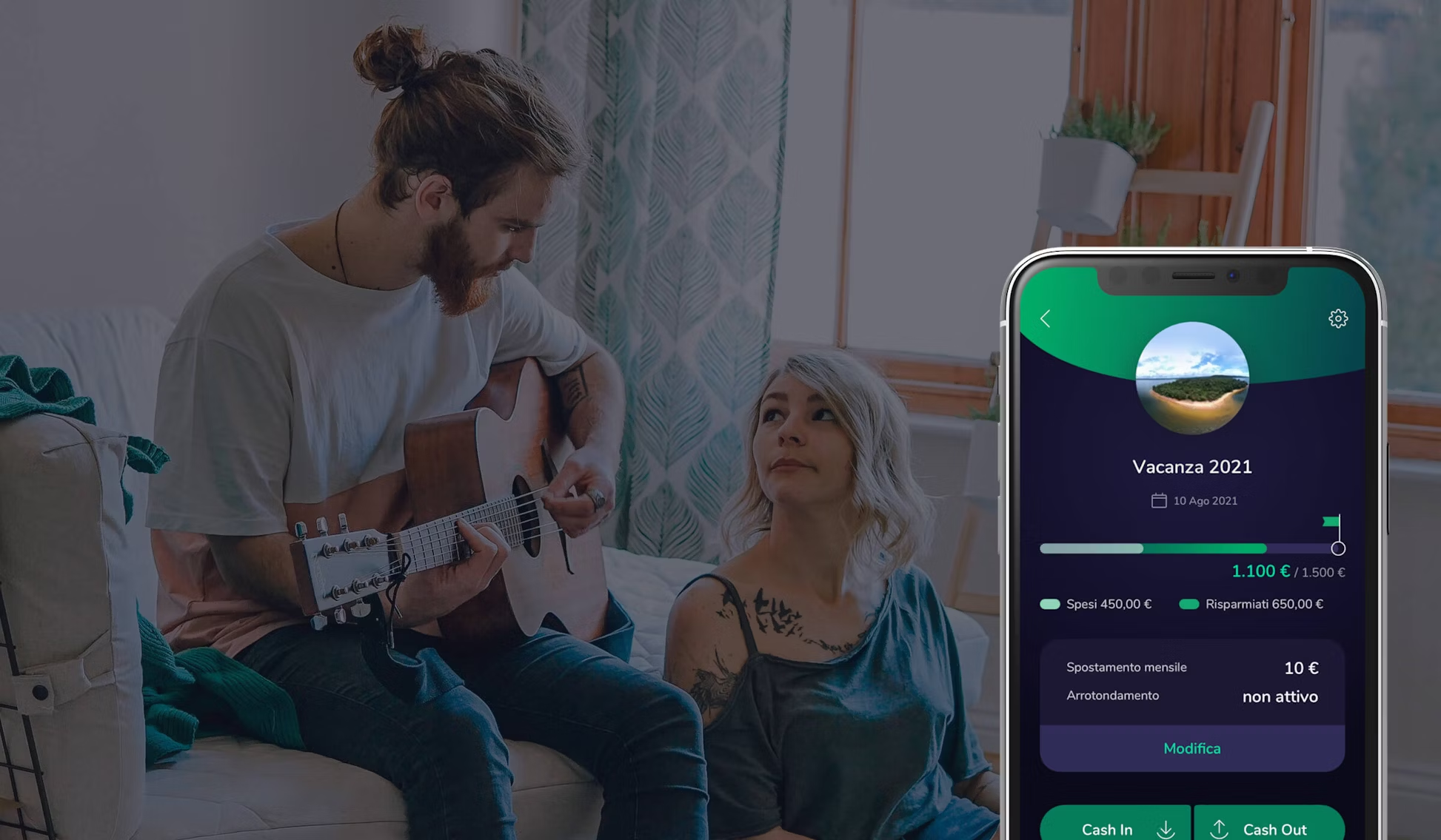
We rebuilt the experience around goals, not accounts. Instead of showing a balance and transaction list, the home screen showed progress toward user-defined objectives: saving for a vacation, reducing carbon footprint, building an emergency fund.
The "Eco Balance" feature tracked the environmental impact of every transaction. Users could see how their spending affected CO2 emissions and offset them through tree planting. This wasn't a marketing feature. It was a core requirement of the Benefit Corporation structure.
Financial education became a game. Instead of documentation nobody reads, we built challenges and tutorials that taught concepts through doing. Users learned about compound interest by setting up automated savings and watching their progress.
The Design System
With 200+ stakeholders and a 10-month timeline, we needed to move fast without breaking things. The design system started with 200+ components that enabled weekly iterations.
We shipped 53 updates in the first year, each one informed by user feedback. The system was designed for evolution, not just launch.
WHAT HAPPENED
16,000 active users in the first week. That number alone exceeded projections. But the 4.7/5 App Store rating is what mattered more. In financial services, where 3.5 stars is typical, that rating signaled something different: users actually liked using a banking app.
Average users saved €5,330 through the goal-tracking features. Account opening dropped from industry-standard 20+ minutes to 8 minutes. The environmental impact tracking drove real behavior change, which satisfied the Benefit Corporation requirements.
"I never imagined banking could be something I looked forward to. Flowe makes my money understandable, helps me save, and even shows how my spending affects the planet."
- Gen Z beta panel member
WHAT I TOOK AWAY
Fintech adoption is not about features. It's about alignment between how the product works and how users think about money.
The compliance nightmare taught me something I use on every regulated industry project since: bring legal and compliance into the design process early, not for approval at the end. The solutions we found together were better than what either team would have created alone.
Category creation requires three things: design the desired behavior first, restructure incentives to reward that behavior, and provide tools to execute. Get all three right, and transformation sticks. Miss one, and users revert to old patterns.
